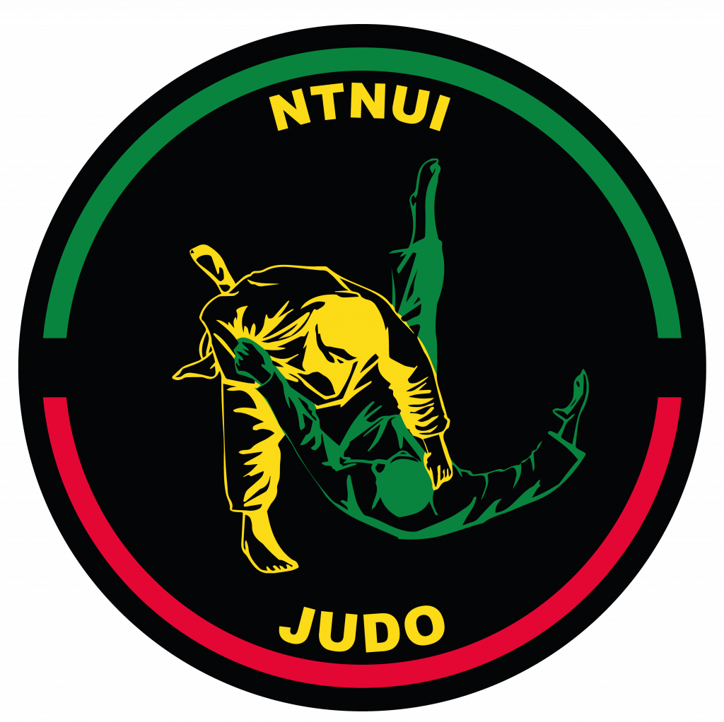
After a while working on the new website, it became clear that our logo lacked in resolution and quality. This made it hard to make promotion material and impossible to print logos on clothing.
This is why we have gotten a new logo! The logo is drawn by Steffen Rysgård from NTNUI Blits – our mediacrew.
The design og the new logo is inspired by the old one, and symbolizes the vision of a gathered NTNUI. As a result of this goal, NTNUI now owns its own brand. This demands that the group logos of NTNUI, has elements from the NTNUI logo itself.
Earlier, it has flourished with different shades of red, green, black & yellow. It still does, but as we made a new logo, we no doubt got the decided colors right for once.
We also managed to get some more green into the logo, as it usually is the most dominant of our club colors. This also creates a nice contrast between Tori and Uke in the logo.